You're getting traffic. People are landing on your product
pages, maybe even adding items to their cart. But the sales just aren't coming
in the way you expected. If this sounds familiar, you're dealing with one of
the most common — and most frustrating — problems in online retail: a conversion
gap between visitors and buyers.
The good news is that low conversion rates are rarely caused
by one dramatic flaw. They're usually the result of several small friction
points that add up. Below are 15 of the most frequent culprits, along with
practical ways to address each one.
1. Slow Page Load Speed
Shoppers are impatient, especially on mobile devices. If
your product pages, cart, or checkout take more than a few seconds to load,
visitors are likely to leave before they even see what you're offering.
Key Point: Page speed isn't just a UX issue — it also
affects how search engines rank your site, so slow loading can hurt you twice.
To improve speed, compress images, minimize unnecessary
scripts and plugins, and consider a content delivery network (CDN) if you serve
customers across different regions.
2. A Confusing or Cluttered Navigation Menu
If shoppers can't quickly find the category or product
they're looking for, they won't dig around — they'll leave. Overly complex
menus, unclear labels, or too many options can overwhelm rather than help.
Keep navigation simple, use clear category names, and make
sure a search bar is visible and functional on every page.
3. Poor-Quality or Insufficient Product Images
Online shoppers can't touch, try on, or physically inspect a
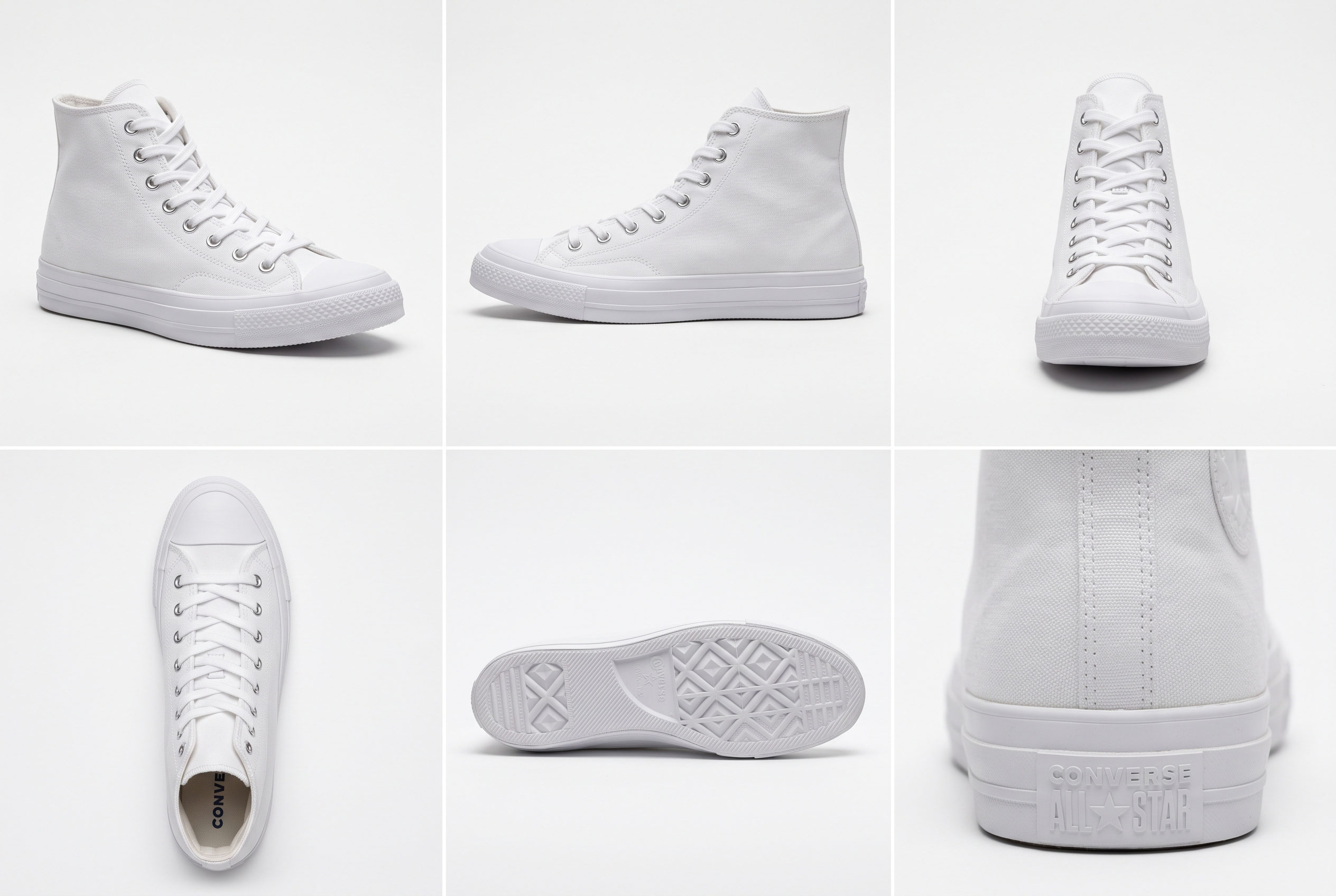
product before buying. Your images are doing that job for them. Blurry, low-resolution,
or single-angle photos make it harder for customers to feel confident about a
purchase.
Include multiple angles, zoom functionality, and lifestyle
shots that show the product in real-world use whenever possible.
4. Weak or Incomplete Product Descriptions
A short, generic description leaves shoppers with unanswered
questions — and unanswered questions usually lead to abandoned carts rather
than customer service inquiries.
Effective product descriptions should answer practical
questions: What is it made of? What size or dimensions does it come in? How
is it used? What problem does it solve?
5. Unexpected Costs at Checkout
Few things frustrate shoppers more than adding an item to
their cart, entering their information, and then discovering unexpected
shipping fees, taxes, or handling charges right before payment.
This is one of the most well-documented causes of cart
abandonment in online retail. Being upfront about total costs — even if that
means showing an estimated total earlier in the process — builds trust and
reduces last-minute drop-off.
6. A Complicated or Lengthy Checkout Process
Every additional field, click, or page in your checkout flow
is another opportunity for a customer to lose patience and abandon the
purchase.
|
Checkout Element |
Impact on Conversion |
|
Guest checkout option |
Reduces friction for first-time buyers |
|
Auto-fill/address lookup |
Speeds up data entry |
|
Progress indicator |
Sets clear expectations |
|
Multiple payment options |
Accommodates buyer preference |
|
Mandatory account creation |
Often increases abandonment |
Simplifying checkout to as few steps as possible — and
offering a guest checkout option — can meaningfully improve completion rates.
7. Limited Payment Options
Not every customer wants to pay the same way. If your store
only accepts one or two payment methods, you may be excluding a meaningful
portion of potential buyers.
Offering options such as credit/debit cards, digital
wallets, and buy-now-pay-later services (where relevant to your market) gives
customers flexibility and can reduce checkout abandonment.
8. Lack of Trust Signals
Shoppers are cautious about sharing payment information with
unfamiliar websites. If your site lacks visible trust indicators, hesitant
visitors may abandon their purchase out of caution rather than lack of
interest.
Trust-building elements include:
- Secure
checkout badges (SSL indicators)
- Clear
return and refund policies
- Genuine
customer reviews and ratings
- Visible
contact information
- Recognizable
payment logos
9. No Clear Return or Refund Policy
Uncertainty about what happens if a product doesn't fit,
work, or meet expectations can stop a purchase before it starts. A clearly
stated, easy-to-find return policy reduces perceived risk.
Key Point: A generous but clearly communicated return
policy often increases sales more than it increases actual returns, because it
removes hesitation at the point of decision.
10. Poor Mobile Experience

A large share of online shopping now happens on smartphones.
If your site isn't properly optimized for smaller screens — with buttons too
small to tap, text that requires zooming, or forms that are awkward to fill out
— mobile visitors will struggle to complete a purchase.
What to Check on Mobile
- Buttons
and links are large enough to tap easily
- Images
resize properly without distortion
- Forms
use appropriate mobile keyboards (numeric for phone numbers, etc.)
- Checkout
doesn't require excessive zooming or scrolling
11. Weak or Missing Calls-to-Action (CTAs)
If it isn't obvious what a visitor should do next —
"Add to Cart," "Buy Now," "Get Started" — they
may simply browse and leave. CTAs that blend into the background or are vaguely
worded reduce the likelihood of action.
Make CTAs visually distinct, use action-oriented language,
and ensure they appear at logical points throughout the shopping journey, not
just at the very end.
12. Irrelevant or Poorly Targeted Traffic
Sometimes the issue isn't the website at all — it's who is
visiting it. If your marketing campaigns are attracting visitors who aren't
genuinely interested in your products, no amount of on-site optimization will
convert them.
Reviewing where your traffic comes from and refining
targeting in your ads, SEO content, or social campaigns can improve the quality
of visitors, not just the quantity.
13. No Sense of Urgency or Scarcity
When there's no reason to act now, some shoppers simply
postpone the decision — and never return. Genuine, honest urgency cues (not
manufactured or misleading ones) can help nudge undecided buyers.
Examples include limited-time shipping promotions or
accurate low-stock notifications — but these should always reflect real
inventory and offers, since misleading scarcity tactics damage long-term trust.
14. Lack of Social Proof
People look to others' experiences before making a purchase
decision, especially with unfamiliar brands. A product page with no reviews,
ratings, or testimonials can feel riskier than one with visible feedback from
previous buyers.
Displaying genuine customer reviews, star ratings, and
(where applicable) user-submitted photos helps new visitors feel more
confident.
15. Poor Site Search Functionality
If a customer knows what they want but your search bar
returns irrelevant results, typos aren't forgiven, or filtering options are
limited, they may give up rather than keep browsing manually.
Investing in a more robust search feature — including
autocomplete, typo tolerance, and useful filters (size, price, color, category)
— can directly reduce lost sales.
Bringing It All Together
Improving conversion rates rarely comes down to one single
fix. It's usually the cumulative effect of removing small frictions: a faster
page here, a clearer policy there, a simpler checkout step somewhere else.
Reviewing your site through the eyes of a first-time, cautious visitor — rather
than as the person who built it — is often the fastest way to spot what's
holding conversions back.