
A stranger hears about your business from a friend, picks up
their phone, and searches your name. Within a few seconds, before they read a
single product description, they have already formed an opinion. Does this look
like a real, reliable business, or does it look like something that might disappear
next month?
That quick judgment is what this article is about. A
professional website doesn’t just present information. It answers the question
every new customer silently asks: “Can I trust these people?” Below, we
look at which parts of a website shape that answer, why they work, and how to
improve them without a large budget.
Why Your Website Is Often the First Impression
For many businesses, the website has replaced the shop
window, the reception desk, and the handshake. People check it before they
call, visit, or buy. When they can’t judge you in person, they judge the
evidence available, and the website is the most visible piece of it.
This matters most when the purchase involves risk. Paying a
stranger online, booking a service, or sharing personal details all require a
leap of faith. A well-built site makes that leap feel smaller.
Key Point: Visitors rarely list reasons for
distrusting a website. They just leave. Professionalism works by removing small
doubts before they add up.
What Makes a Website Look Professional?
“Professional” is not about expensive animation or trendy
effects. It is about consistency, clarity, and care. Visitors notice
when those are present, and they notice faster when they are missing.
Clean Design and Consistent Branding
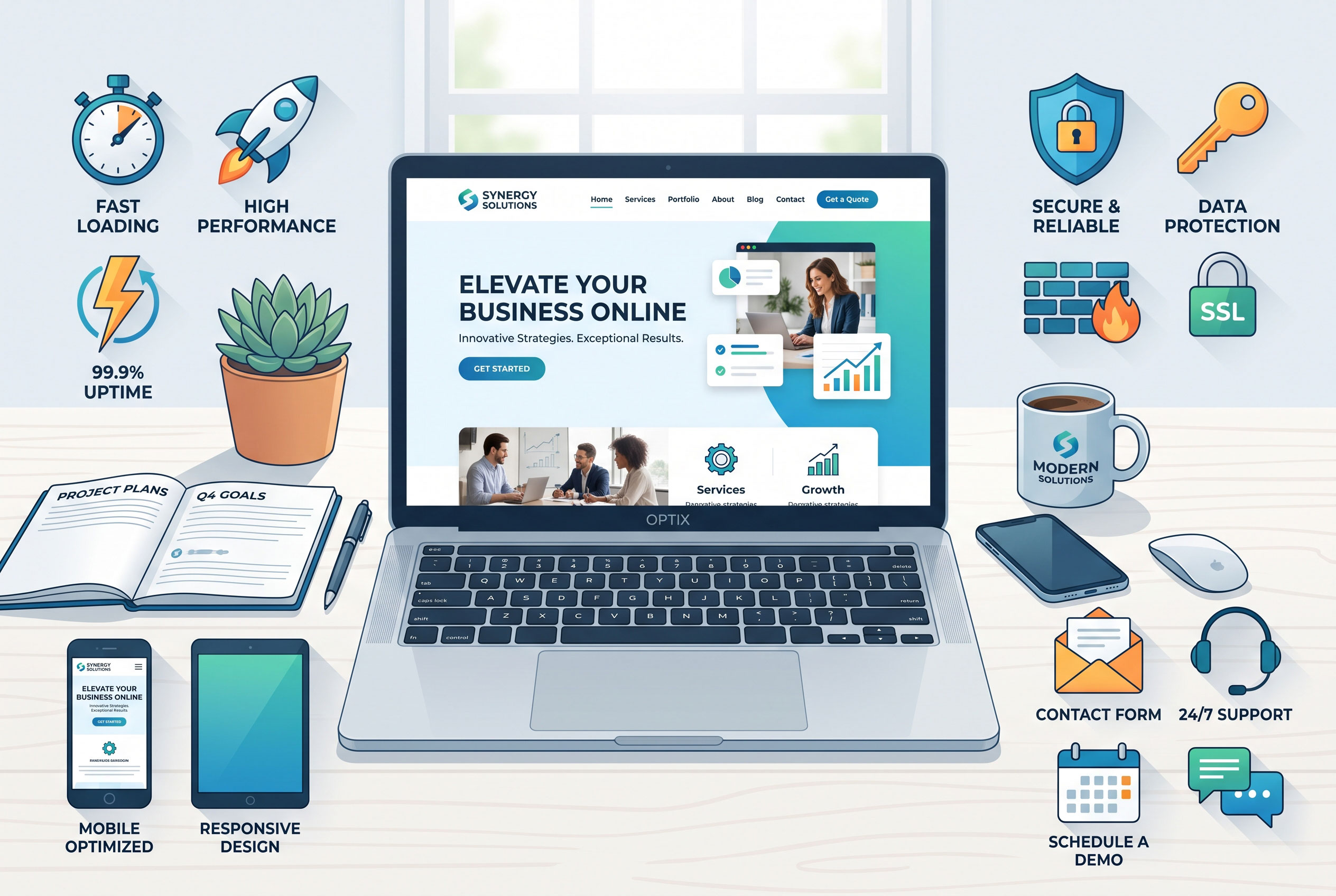
A professional site uses a limited set of fonts and colors,
enough white space to breathe, and a layout that guides the eye toward what
matters. Logos, buttons, and headings look like they belong together.
Inconsistency sends the opposite message. Mismatched fonts,
stretched images, and cluttered pages suggest nobody is paying attention, and
visitors may assume the same about customer service.
Speed and Mobile Usability
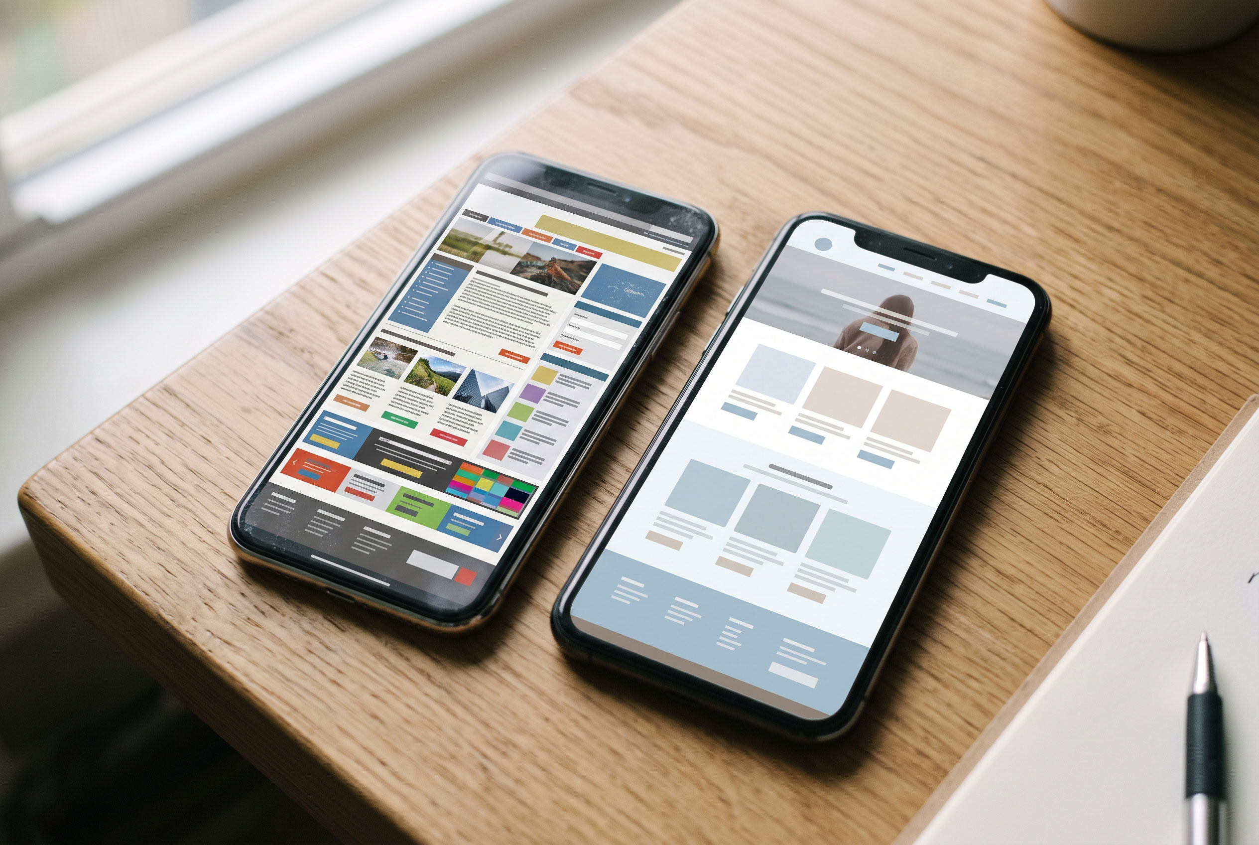
Many visitors arrive on a phone. If text is tiny, buttons
overlap, or the page takes too long to load, the experience feels careless. A
site that loads quickly and adapts to small screens shows respect for the
visitor’s time.
You can test this yourself. Open your site on your own
phone, on mobile data rather than Wi-Fi, and try to complete the main task a
customer would: find your phone number, view a product, or book an appointment.
Clear, Well-Edited Writing
Spelling mistakes, vague claims, and copy that sounds like
it was written for search engines rather than people all weaken credibility.
Plain language works better. Say what you do, who it is for, and what happens
next.
What Makes a Website Trustworthy? (Quick Answer)
A trustworthy website combines a clean, consistent design
with secure browsing (HTTPS), clear contact details, an honest About page,
transparent pricing or process information, and real proof such as genuine
customer reviews. Each element reduces uncertainty, and together they signal
that a real, accountable business operates behind the screen.
The Trust Signals Visitors Look For
Some elements work as shortcuts. Visitors scan for them,
often without realizing it.
|
Trust Signal |
What It Tells the Visitor |
Practical Example |
|
HTTPS padlock |
Data sent to the site is encrypted |
A secure checkout or contact form |
|
Real contact details |
Someone can be reached if something goes wrong |
Phone, email, and a physical address or service area |
|
About page with real people |
An actual team is accountable |
Names, roles, and a short, honest company story |
|
Customer reviews |
Others have used the service |
Reviews linked to real names or a review platform |
|
Clear policies |
Rules are stated before problems occur |
Returns, privacy, and cancellation terms |
|
Portfolio or case studies |
The business has done this work before |
Before-and-after examples with permission from clients |
Security Is Part of Professionalism
When a website uses HTTPS, the connection between the
visitor’s browser and the site is encrypted. Major browsers warn visitors when
a page doesn’t use it, and those warnings are enough to make many people leave,
especially on pages that ask for personal or payment details.
Security also covers how you treat information. A short,
readable privacy policy that explains what you collect and why shows maturity.
Keeping the site’s software updated matters too, since a hacked or defaced
website damages trust quickly, even when the cause was a simple missed update.
Transparency Turns Visitors into Customers
Clever design cannot compensate for hiding the basics.
Visitors trust businesses that answer their obvious questions without a fight.
Make Contact Easy
A hidden or missing contact page raises suspicion. Provide
more than one way to reach you, and respond when people use them. A contact
form that never gets answered is worse than no form at all.
Show the People Behind the Business
An About page doesn’t need to be long. Photos of real team
members, a sentence about how the business started, and a clear description of
what you stand for help visitors see you as people rather than a faceless
brand. Generic stock photos of smiling strangers do the reverse.
Be Upfront About Price and Process
You may not be able to list exact prices, but you can
explain how pricing works, what is included, and what the first steps look
like. Uncertainty about cost is one of the most common reasons people hesitate.
Even a “from” price or a short description of how quotes are given can help.
Social Proof, Done Honestly
Reviews and testimonials are powerful because they come from
someone other than you. They are also easy to misuse.
- Use
real feedback. Invented or heavily edited testimonials can backfire,
and in many places fake reviews also raise legal problems.
- Be
specific. A review that mentions what the customer bought and what
went well is more convincing than “Great service!”
- Include
imperfect feedback when it’s fair. A profile made entirely of
five-star praise can look curated, and a thoughtful reply to a critical
review often builds more trust than silence.
- Ask
permission. Get consent before showing a client’s name, photo, or
project.
Professional vs. Neglected: A Side-by-Side View
|
Area |
Professional Website |
Neglected Website |
|
Design |
Consistent fonts, colors, and spacing |
Mixed styles, cluttered pages |
|
Content |
Current, edited, specific |
Outdated offers, typos, vague claims |
|
Mobile experience |
Readable and easy to tap |
Tiny text, broken layout |
|
Security |
HTTPS and clear privacy policy |
Browser warnings, no policy |
|
Contact |
Several visible options |
Hidden or non-working form |
|
Proof |
Real reviews and examples |
None, or obviously fake |
Common Mistakes That Quietly Damage Trust
Most trust problems come from neglect rather than bad
intent. Watch for these:
- Outdated
information. Old opening hours, discontinued services, or a copyright
year from several years ago make visitors wonder whether anyone is still
running the business.
- Broken
links and images. One broken page can feel minor, but several suggest
the site has been abandoned.
- Pop-ups
that block the page. Aggressive pop-ups appearing before the visitor
has read anything feel pushy.
- Exaggerated
promises. Claims like “the best in the world” without evidence make
careful readers skeptical.
- Inconsistent
details. If your phone number or address differs between your website
and your social profiles, visitors notice.
A Practical Starting Checklist
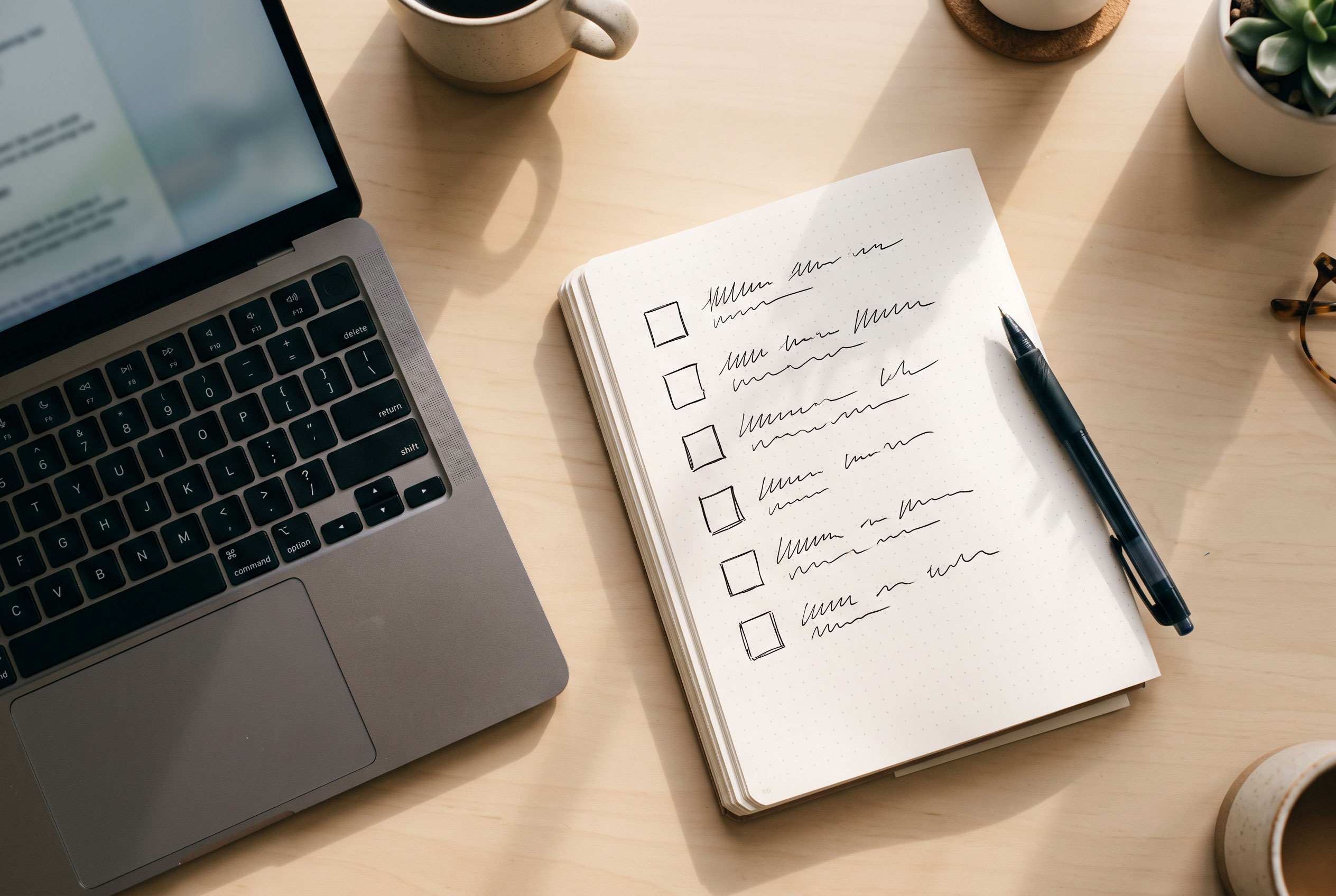
You don’t need a full redesign to improve trust. Work
through this list in order:
- Check
that your site loads over HTTPS with no browser warnings.
- Test
the site on a phone and fix anything awkward.
- Add or
update your contact details, so they appear on every key page.
- Rewrite
your About page to include real names and a short, honest story.
- Add a
handful of genuine reviews or case studies, with permission.
- Publish
simple policies for privacy, returns, or cancellations, whichever apply.
- Read
every page once for typos, outdated claims, and broken links.
Key Point: Trust is built from many small, consistent
details. Fixing the basics usually helps more than adding new features.
Trust Is Earned in the Details
A professional website won’t make a weak business look
strong for long, but it will stop a good business from looking doubtful. Clean
design, fast and secure pages, open contact details, honest descriptions, and
real proof all tell visitors the same thing: you are accountable for what you
offer.
Start with the checklist above, one item at a time. Each
improvement removes a small reason to hesitate, and customers who hesitate less
are more willing to take the next step.