You have probably seen thousands of logos this week, yet you
could likely sketch only a handful from memory. A swoosh, a bitten apple, a
pair of golden arches. Those marks stuck because they were built to.
A memorable logo is not an accident, and it is not always
the most beautiful one. It is the one your brain can store, recognize, and
recall with very little effort. This article explains the design principles
behind that effect, shows how well-known brands apply them, and gives you a
checklist to test your own logo.
What Makes a Logo Memorable?
Quick answer: A memorable logo is simple,
distinctive, and consistent. It uses one clear idea, a shape or wordmark
that stands apart from competitors, and a limited color palette. It also stays
recognizable at any size, from a favicon to a billboard, so people can
recognize it instantly and recall it later.
That definition contains three ideas worth unpacking. Simple
means the mark is easy to process. Distinctive means it does not look
like everyone else's. Consistent means people see it the same way every
time, which is how recognition builds.
Memorability also depends on exposure. A great logo on a
brand nobody encounters will not be remembered. Design gives a logo the
capacity to stick, and repetition does the rest.
Principle 1: Simplicity Beats Detail
The human eye recognizes simple forms faster than complex
ones. Logos with fewer elements are quicker to read, easier to reproduce, and
harder to misremember.
Think of the Nike Swoosh. It is one curved stroke,
with no text needed. Designer Carolyn Davidson created it in 1971, reportedly
for a fee of $35, and it has since become one of the most recognized marks in
the world. Apple's silhouette follows the same logic. The company's earliest
logo was an intricate illustration of Isaac Newton under a tree. It was
replaced within a year by a simple apple shape with a bite taken out.
Simplicity does not mean blandness. It means removing
everything that does not serve the core idea.
Key Point: If you can't describe your logo in one
short sentence, it probably contains too many ideas.
Principle 2: A Distinctive Shape or Idea
A simple logo that looks like ten competitors' logos is
forgettable. Distinctiveness means the mark has a feature people can latch
onto.
Consider how many software startups use a blue circle or a
generic abstract swirl. Now consider the Amazon logo, where the smile-shaped
arrow runs from A to Z, hinting at a wide selection. Or the FedEx
wordmark, which hides an arrow in the negative space between the "E"
and the "x." Many people never notice it consciously, but those who
discover it rarely forget it.
To find your distinctive angle, look at your industry's top
ten logos side by side. Note what they share (colors, symbols, fonts), then
deliberately move away from those patterns.
Principle 3: Meaningful, Not Literal
The strongest logos connect to the brand's story or values
without spelling it out. A bakery does not need a loaf of bread. A hidden
detail, a name-based monogram, or a shape with personal significance can carry
more weight.
The Toblerone packaging is a good example. The
mountain reflects the chocolate's Swiss origins, and a bear is hidden in the
mountain's outline, a nod to the city of Bern. The brand's symbolism has depth,
but the logo still reads clearly.
Meaning helps memory because people remember stories better
than shapes. Just keep the meaning secondary to clarity. A logo that needs a
paragraph to explain has already lost its audience.
Principle 4: Color That Works Hard
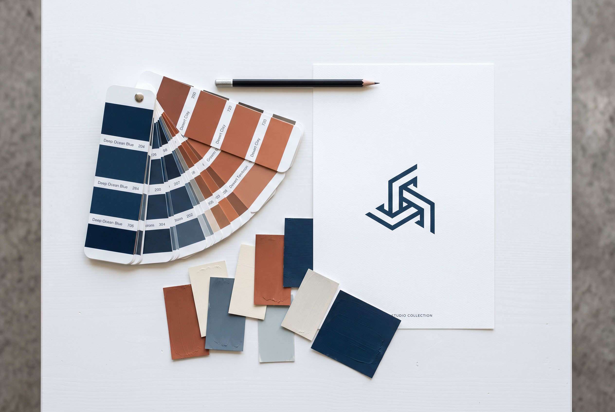
Color is often the first thing people register. Brands such
as Coca-Cola (red), Tiffany & Co. (a signature robin's-egg blue), and UPS
(brown) are strongly tied to their colors.
Practical color guidelines:
- Limit
your palette. One or two main colors are easier to remember than five.
- Consider
the category. Choosing a color your direct competitors don't use helps
you stand out.
- Check
contrast. The logo must remain legible on light and dark backgrounds.
- Test
in black and white. If the design only works in color, it is fragile.
Color associations vary by culture, so brands with an
international audience should research how their palette is perceived in each
market. Avoid relying on universal claims about what a color "always"
means. The associations are real but flexible.
Principle 5: Typography That Fits the Brand
For wordmarks, and for logos that pair a symbol with text,
the typeface does much of the work. A font sets tone before a single word is
read: a rounded sans-serif feels friendly, a high-contrast serif feels
editorial, and a geometric sans feels modern.
Two common mistakes:
- Using
a default or overused font. It makes the brand blend in.
- Mixing
too many styles. One typeface, sometimes two, is usually enough.
Google's 2015 redesign illustrates the trend toward
clean sans-serif wordmarks. The company moved from a serif typeface to a
simpler geometric one that scales better across phones, watches, and desktops.
Principle 6: Versatility Across Sizes and Contexts
A logo lives in many places: an app icon, a social media
profile picture, a receipt, a shipping box, a website header, embroidery on a
jacket. A memorable logo survives all of them.
Use this quick versatility test:
|
Test |
What to check |
|
Small size |
Is it still readable at roughly 16 to 32 pixels, like a
browser favicon? |
|
Single color |
Does it work in black only, or white only? |
|
Reversed |
Does it hold up on a dark background? |
|
Squint test |
With your eyes half-closed, is the basic shape still
recognizable? |
|
Print and screen |
Does it reproduce cleanly in both? |
Many brands now keep several versions: a full logo, a
compact version, and an icon-only mark. This flexibility supports consistency
rather than undermining it.
Principle 7: Timelessness Over Trends
Trends fade quickly. Gradients, heavy drop shadows, and
ultra-thin fonts have each had their moment. A logo built around a passing
style tends to age poorly and needs frequent redesigns, which resets
recognition.
Timelessness does not mean never changing. Many brands make
gradual refinements that keep the core recognizable. Others make larger shifts,
as when Twitter became X in 2023, a rebrand that drew strong public
reaction and showed how risky it can be to abandon a widely recognized symbol.
The IBM stripes logo, designed by Paul Rand, is often cited
as an example of a mark that has endured because its core idea is strong.
Common Mistakes That Make Logos Forgettable
- Copying
competitors. Similar logos blur together in memory.
- Overcomplicating.
Too many colors, effects, or symbols.
- Following
trends blindly. The design dates quickly.
- Ignoring
small sizes. Fine detail disappears on mobile screens.
- Inconsistent
use. Changing colors, proportions, or fonts across platforms weakens
recognition.
- Skipping
research. Without checking existing logos, you risk accidental
similarity and even trademark trouble.
A Practical Checklist for Testing Your Logo

Before finalizing a design, ask these questions:
- Can
someone describe it after seeing it for five seconds?
- Can
they sketch a rough version from memory?
- Does
it look different from your top five competitors?
- Does
it work in black and white and at very small sizes?
- Would
you still be comfortable with it in ten years?
Show the logo briefly to a few people who don't know the brand,
then ask what they remember. Their answers are more useful than your own
opinion.
Final Takeaway
Memorability comes from restraint and clarity, not from
cleverness alone. Choose one strong idea, give it a distinctive form, use color
and type with purpose, and make sure it works everywhere it will appear. Then
use it consistently, because a logo becomes memorable through repetition, not
through design alone.