Your logo shows up on a shop sign, a business card, a
website header, and a social media profile photo roughly the size of a postage
stamp. It has to work in all of those places, often with only a second of
attention from the viewer.
That is why logo mistakes are expensive. A weak logo can
make a capable business look careless, and fixing it later means updating
signage, packaging, documents, and online profiles. This guide covers the most
common logo design mistakes, why they cause trouble, and how to avoid them.
What Makes a Logo Ineffective?
Quick answer: A logo is ineffective when people
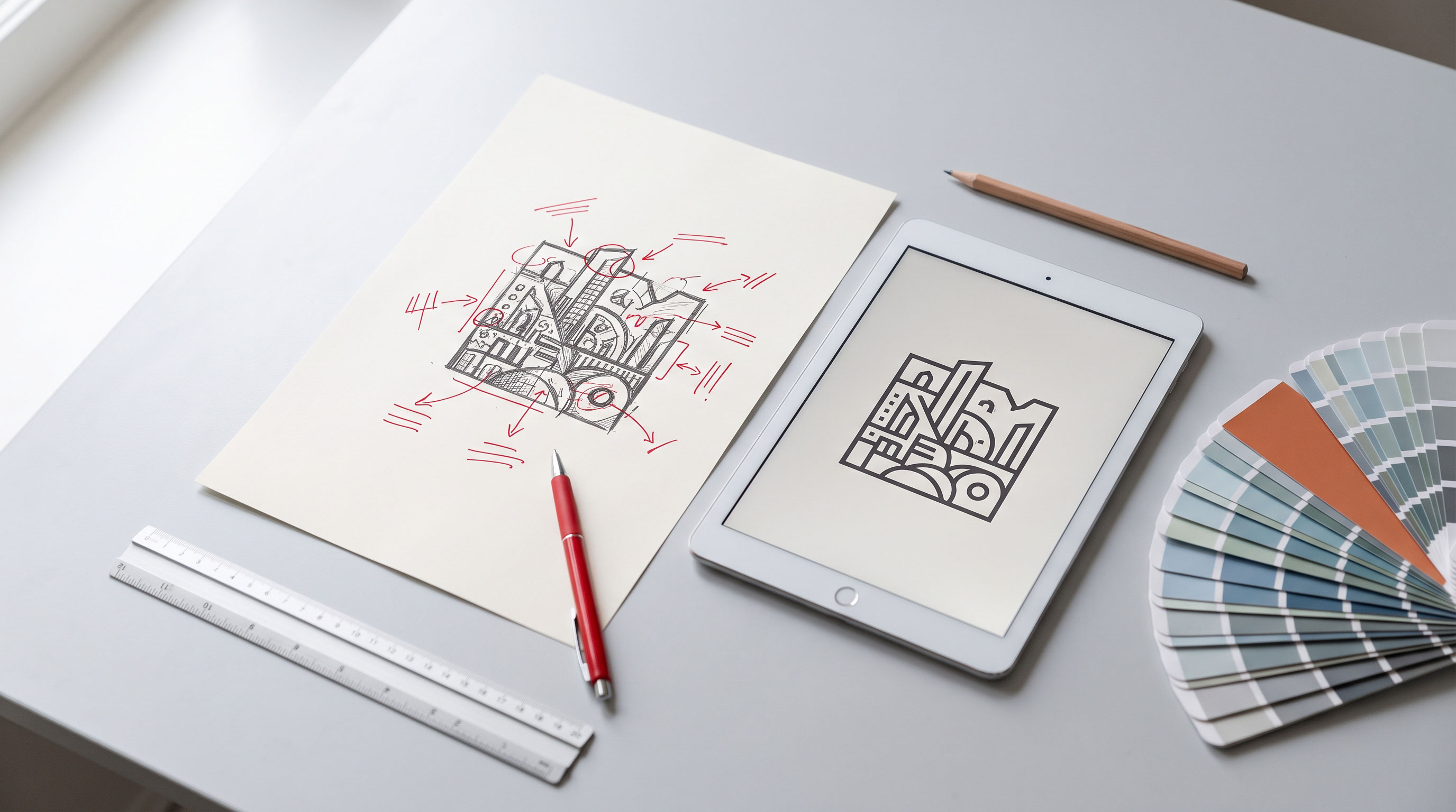
cannot recognize, read, or remember it. Common causes include too much detail,
hard-to-read type, poor color contrast, and artwork that breaks down at small
sizes or in black and white. A good logo stays clear everywhere it appears.
Most weak logos share one root problem: they were designed
to look impressive on a large screen instead of to work in real use. Keep that
test in mind as you read the mistakes below.
The Most Common Logo Design Mistakes
1. Making the Design Too Complicated
Gradients, small icons, thin lines, and decorative layers
can look rich on a large monitor. Shrink the same logo to a phone icon or a pen
imprint and the details turn to mush.
Simple marks are easier to recognize and easier to
reproduce. Many well-known logos are built from just a shape, a color, or a
clean wordmark.
Key Point: If your logo cannot be sketched from
memory in a few seconds, it is probably carrying more detail than it needs.
2. Chasing Design Trends
Trends feel safe because everyone is using them. The risk is
that a style tied to one moment can look dated within a few years, and a trendy
logo often looks like everyone else's.
Before adopting a popular look, ask whether it suits your
business and audience or whether you are just copying what you have seen
lately. A timeless, modestly styled logo usually ages better than a fashionable
one.
3. Choosing Fonts That Are Hard to Read
Typography carries much of a logo's personality, and it is
easy to get wrong. Common problems include:
- Ornate
script fonts that are hard to read at small sizes
- Too
many typefaces, which makes the logo feel chaotic
- Tight
or uneven letter spacing that makes words blur together
- Free
fonts with unclear licensing, which can cause trouble for commercial
use
Limit a logo to one or two typefaces. If people have to
pause to decode your business name, the font is doing the wrong job.
4. Poor Color Choices
Color affects mood and recognition, but it also affects
legibility. Low-contrast pairings, like light grey on white, disappear on
screens and in print. Using too many colors makes a logo harder to reproduce
consistently and more expensive to print.
Color meaning also varies between cultures and industries,
so a color that suits one market may send a different signal in another.
Research your audience, and check that the logo still reads clearly with the
color removed.
5. Ignoring Scalability and Versatility
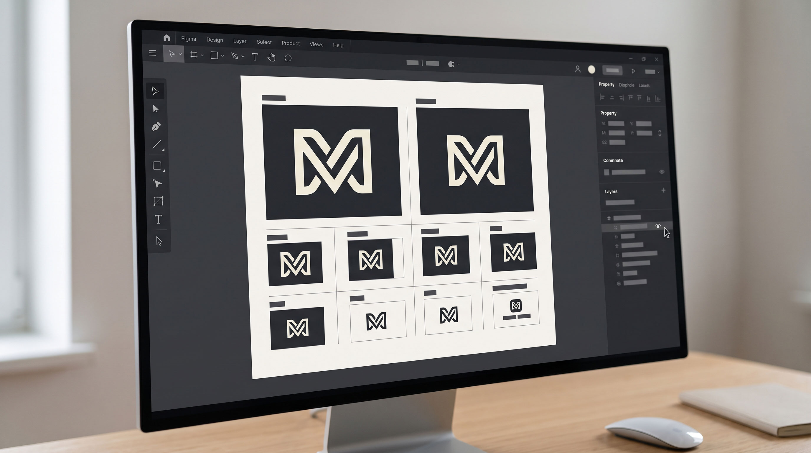
A logo needs to survive a billboard, a favicon, an
embroidered shirt, and a rubber stamp. Many logos are approved only in one
context, usually a large preview, and fail everywhere else.
Test your logo in these situations before approving it:
- At a
very small size, such as a browser tab icon
- In
black and white
- On a
dark background and on a light background
- In a
horizontal and a stacked (square-friendly) layout
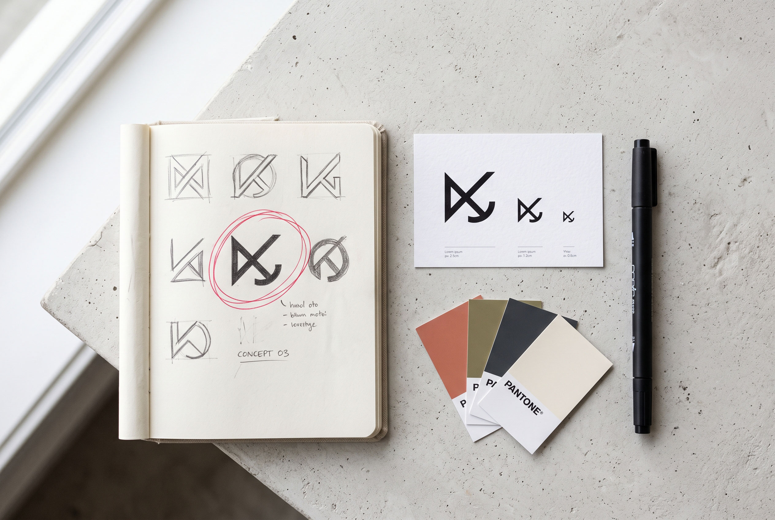
Many brands keep a few variations, such as a full logo, a
compact version, and an icon-only mark, so the right version is available for
each space.
6. Copying Other Brands or Relying on Clip Art
Borrowing visual ideas from competitors makes your business
forgettable. It can also create legal risk: if your mark is confusingly similar
to an existing one, you may face a dispute or be unable to register it as a
trademark.
Generic clip art and stock icons have a similar weakness.
Other businesses may be using the same graphic, and you may not be able to
claim exclusive rights to it. Before committing, search the trademark database
in your country or region, and check international records such as WIPO's
Global Brand Database for similar marks.
7. Disconnecting the Logo from the Business
A logo should reflect what the company does and who it
serves. A playful, rounded design may suit a children's bakery but feel wrong
for a law firm or an accounting practice.
The mistake often starts before design begins. Without a
clear brief covering the audience, the brand's personality, and the
competitors, a designer can only guess. Spend time on those answers first, and
the visual decisions become much easier.
8. Using Literal or Cliché Imagery
A globe for an international company, a lightbulb for ideas,
a handshake for trust: these symbols are so common that they barely register.
Literal imagery tells people what the business does but gives them nothing to
remember.
A distinctive idea, such as a clever shape, a meaningful
initial, or an unusual but fitting color, tends to stand out more than an
obvious symbol.
9. Skipping the Right File Formats
Even a well-designed logo causes problems if you only have a
low-resolution image. A small, blurry file stretched to fit a banner looks
unprofessional.
Ask for a complete file set, including:
- Vector
files (such as SVG, EPS, or AI) that scale to any size without losing
quality
- PNG
files with transparent backgrounds for web use
- Color
and single-color versions for different print situations
10. Designing in a Rush and Skipping Feedback
Logos created in a single sitting often reflect the first
idea rather than the best one. A better process involves exploring several
directions, narrowing them down, and gathering feedback from people who match
your target audience.
Feedback should test clarity, not taste. Ask people what
they notice first, what the logo seems to say about the business, and whether
they would recognize it after seeing it briefly.
Logo Mistakes at a Glance
|
Mistake |
Why It Hurts |
Better Approach |
|
Too much detail |
Unclear at small sizes |
Simplify to essential shapes |
|
Trend-driven style |
Looks dated quickly |
Choose a timeless direction |
|
Weak typography |
Name is hard to read |
Use one or two clear typefaces |
|
Low-contrast color |
Disappears on screen and print |
Test contrast and grayscale |
|
One-size design |
Fails across formats |
Create adaptable variations |
|
Copied or stock imagery |
Legal and originality risks |
Commission original work and check trademarks |
|
Wrong fit for audience |
Sends mixed signals |
Write a brand brief first |
|
Missing vector files |
Blurry results when enlarged |
Request SVG, EPS, or AI files |
How to Review Your Logo Before Launch
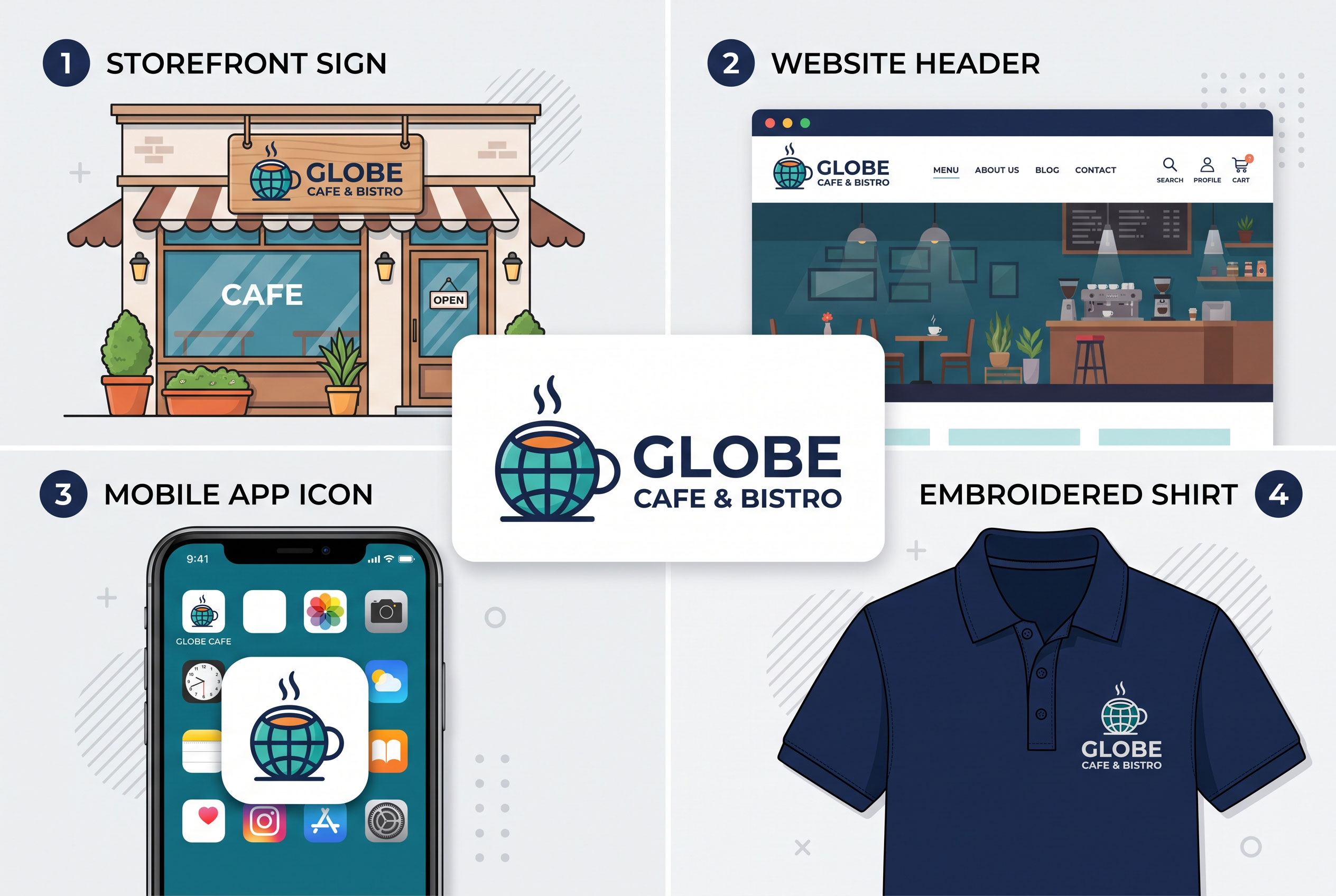
Run through this short checklist before you finalize
anything:
- Squint
test: Blur your eyes or shrink the logo. Is the main shape still
recognizable?
- Black-and-white
test: Does it work without color?
- Distance
test: Can someone read the name from across a room or at a glance on a
phone?
- Originality
check: Does a quick search turn up similar logos in your industry?
- Context
test: Place it on a mock-up of a website, a business card, and a
social profile.
Should You Redesign an Existing Logo?
Not every flawed logo needs a complete overhaul. If your
audience already recognizes it, a refinement (cleaner lines, better
spacing, updated colors) may fix the problems without losing familiarity. A
full redesign makes more sense when the logo no longer represents the business,
fails in key formats, or creates legal trouble.
A Logo Should Make Things Easier
The best logo advice comes down to one idea: a logo is a
tool, not a decoration. It should help people recognize your business quickly,
remember it later, and trust what they see. Avoiding the mistakes above,
especially overcomplication, weak scalability, and borrowed ideas, will take
you most of the way there. Take the time to test the design in real situations,
and you will avoid costly fixes down the road.