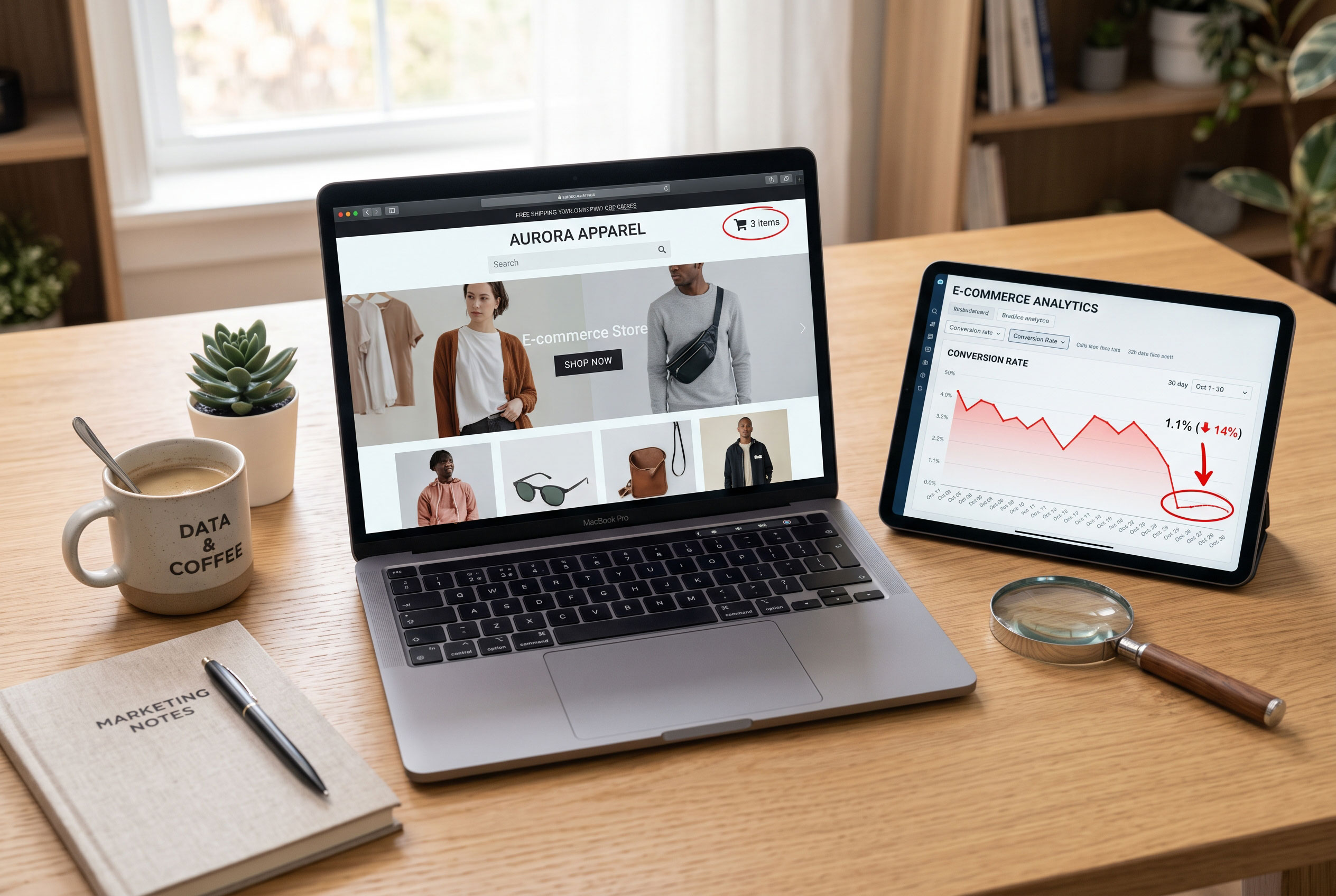

A shopper finds a jacket they like, adds it to the cart, and
only then discovers that shipping costs almost as much as the jacket. They
close the tab. Nothing was wrong with the product or the price. The experience
simply broke their trust at the wrong moment.
That kind of friction is the real enemy of an online store. User
experience (UX) is everything a visitor feels while moving through your
site: finding products, judging them, paying, and getting help if something
goes wrong. This guide walks through the changes that matter most and how to
check whether they work.
Quick Answer: What Is the Fastest Way to Improve Online
Store UX?
Key Point: Find where visitors leave, then fix the
biggest obstacle first.
The fastest way to improve online store UX is to find where
visitors get stuck and fix those points first. Check analytics for pages with
high exit rates, watch session recordings, and read customer messages. Then
simplify navigation, clarify product pages, speed up the site, and shorten
checkout.
Start With Evidence, Not Opinions
Many stores redesign based on taste. A better starting point
is watching what people actually do.
You can collect useful evidence without a big budget:
- Analytics
reports: Look for pages where many visitors leave, and for steps in
the checkout where people drop off.
- Session
recordings and heatmaps: Tools of this kind show where visitors click,
scroll, hesitate, or tap on things that are not clickable.
- Customer
service messages: Repeated questions ("Do you ship to my
country?", "Is this available in black?") point to
information your site fails to show.
- On-site
search terms: What people type into your search bar reveals what they
expect to find and what they cannot.
Write down the three or four problems that appear most
often. That list becomes your improvement plan.
Help People Find Products Quickly
If shoppers cannot find an item, they cannot buy it.
Navigation and search carry most of that weight.
Keep Navigation Simple and Predictable
Use category names your customers would use, not internal
jargon. "Running Shoes" is clearer than "Performance
Footwear." Keep the main menu short, and avoid burying popular categories
three levels deep.
Breadcrumbs (the small trail such as Home > Kitchen
> Knives) help visitors who land on a product page from a search engine
understand where they are and move back up a level.
Make Search Forgiving
A good search bar handles typos, plurals, and synonyms. If
someone searches "sneekers" and sees "no results," many
will leave. Show suggestions as they type, and when a search truly has no
match, offer popular categories instead of a dead end.
Use Filters That Match Real Decisions
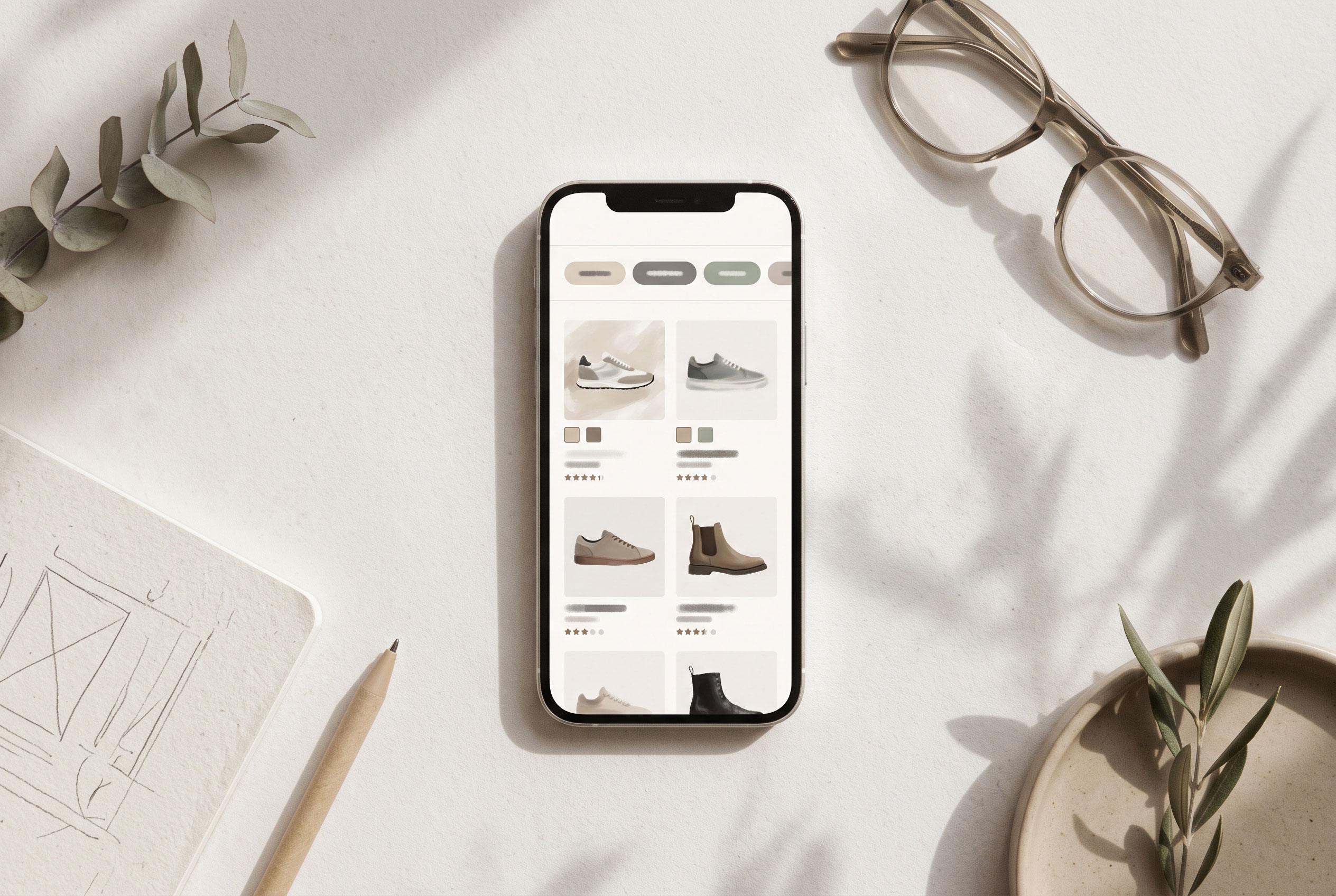
Filters should reflect how people choose. For clothing, that
means size, color, and price. For electronics, it might be screen size or
battery life. Show active filters clearly and make them easy to remove. Hiding
a clear-all option frustrates people quickly.
Build Product Pages That Answer Questions
A product page replaces the shop assistant. It should answer
the questions a customer would ask in person.
Good product pages usually include:
- Clear
photos from several angles, plus an image showing scale or the product
in use
- A
price that matches the final cost, with shipping and tax information
visible early
- Specific
descriptions covering materials, dimensions, compatibility, and care
- Stock
and delivery information so buyers know when to expect the item
- Customer
reviews, ideally including both positive and critical comments
- A
prominent, clearly labeled button such as "Add to cart"
Avoid vague marketing language. "Premium quality"
tells a buyer nothing, while "stainless steel blade, 20 cm, dishwasher
safe" helps them decide.
Size and fit are a common source of uncertainty. A simple
size chart, or a note on how an item runs, can prevent doubt and returns.
Make the Site Fast and Mobile-Friendly
Many shoppers browse on phones, so a store that works well
only on a desktop screen is leaving people behind.
Speed
Slow pages frustrate visitors. Google measures page
experience with the Core Web Vitals: loading speed (Largest Contentful
Paint), responsiveness (Interaction to Next Paint), and visual stability
(Cumulative Layout Shift). You can check these in Google's free PageSpeed
Insights tool.
Common fixes include compressing images, removing apps and
scripts you no longer use, and choosing reliable hosting.
Mobile Design
On a phone, small details matter:
- Buttons
should be large enough to tap without accidental clicks.
- Text
should be readable without zooming.
- Forms
should open the right keyboard (numeric for phone numbers, for example).
- Pop-ups
should be easy to close and should not cover the whole screen.
Test your store on a real phone, not just a resized desktop
browser.
Simplify Checkout
Checkout is where interest turns into revenue, and where
unnecessary effort costs the most. Every extra field is another reason to stop.
Ways to reduce friction:
- Offer
guest checkout. Forcing account creation before payment annoys
first-time buyers. Offer an account after the purchase instead.
- Ask
only for what you need. Remove optional fields or hide them behind a
link.
- Show
the total cost early. Surprise fees are a well-known reason people
abandon carts.
- Provide
familiar payment options. Cards, digital wallets, and local payment
methods popular in your customers' regions all help.
- Show
progress. A simple step indicator tells people how much is left.
- Explain
errors clearly. "Postal code is missing" is better than a
red banner saying "Invalid input."
Key Point: Fewer decisions at checkout usually means
fewer abandoned carts.
Earn Trust Before Asking for Payment
Customers share personal and payment details, so they look
for signs that your store is legitimate. Trust comes from small, consistent
signals rather than badges alone.
- Use HTTPS
across the entire site.
- Publish
clear shipping, return, and refund policies in plain language.
- Display
contact details and a way to reach a real person.
- Keep reviews
honest, including moderate ratings. A page with only perfect reviews
can feel suspicious.
- Keep
design and wording consistent, since typos and broken layouts weaken
credibility.
Design for Accessibility
Accessibility makes your store usable for people with
visual, hearing, motor, or cognitive differences, and it tends to improve the
experience for everyone.
The Web Content Accessibility Guidelines (WCAG),
published by the W3C, are the widely used reference. Practical starting points
include:
- Writing
alt text for product images
- Using
enough color contrast between text and background
- Making
the site usable with a keyboard alone
- Labeling
form fields clearly
- Avoiding
information that depends only on color (for example, marking required
fields only in red)
You do not need to fix everything at once. Start with your
highest-traffic pages and checkout.
Common Friction Points and Their Fixes
|
Friction point |
What the shopper experiences |
Practical fix |
|
Hidden shipping costs |
Surprise at the final step |
Show estimates on product pages or in the cart |
|
Weak search |
"No results" for obvious terms |
Add typo tolerance and suggestions |
|
Mandatory accounts |
Extra effort before paying |
Offer guest checkout |
|
Slow image-heavy pages |
Waiting, then leaving |
Compress images, remove unused scripts |
|
Vague product details |
Uncertainty about fit or specs |
Add specific measurements and sizing help |
|
Tiny mobile buttons |
Mis-taps and frustration |
Increase tap targets and spacing |
Test Changes Before Trusting Them

Even experienced designers guess wrong. Treat each
improvement as a hypothesis.
- Pick
one problem backed by evidence.
- Make
one change so you know what caused the result.
- Compare
results over a reasonable period, using conversion rate, cart
abandonment, or search success.
- Run
an A/B test if your traffic is high enough to give meaningful results.
Low-traffic stores can instead run quick usability tests with five or so
people completing a task while you watch.
Keep a simple log of what you changed and what happened. It
prevents repeating failed ideas.
Where to Go From Here
Improving an online store's user experience is less about a
dramatic redesign and more about removing small obstacles in sequence. Start by
finding where customers struggle, then work through navigation, product pages,
speed, checkout, trust, and accessibility one step at a time.
Your next move can be small. Open your store on your phone,
try to buy something as a stranger would, and note every moment you hesitate.
Those moments are your to-do list.