
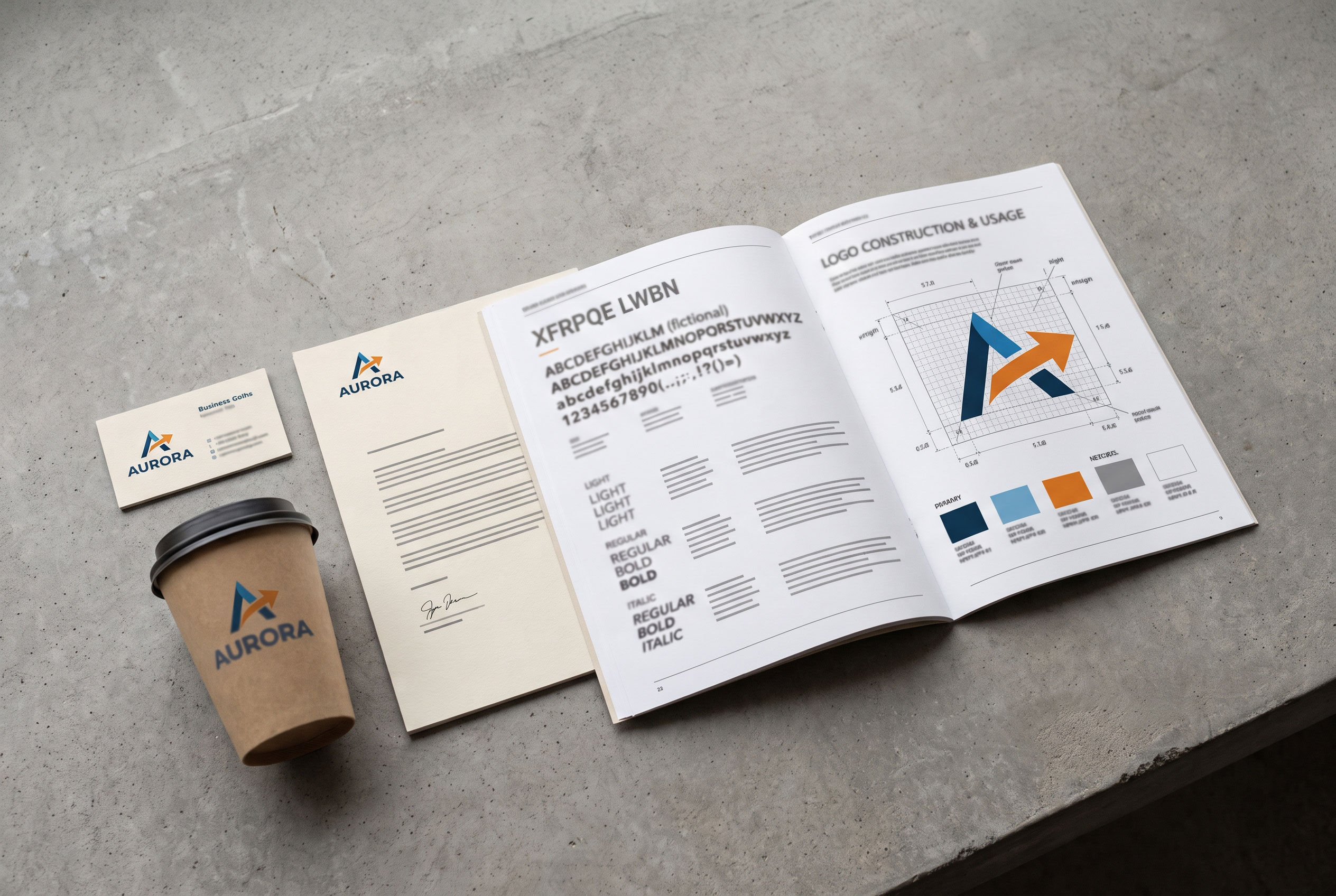
Brand identity is the set of deliberately designed
elements and messages through which an organization, product, service, or
person presents itself and distinguishes itself from others. It commonly
includes a name, logo, color palette, typography, imagery, tone of voice, and
consistent behaviors, and it is usually recorded in a document known as brand
guidelines.
Quick answer: Brand identity is the collection of
visual, verbal, and behavioral elements that an organization creates to express
who it is and to be recognized among competitors. It includes names, logos,
colors, typefaces, and tone of voice. It differs from brand image, which is how
audiences actually perceive the brand.
The practice grew out of early twentieth-century industrial
design and expanded through specialist consultancies from the 1960s onward.
Scholars such as David Aaker and Jean-Noël Kapferer later
proposed formal models in the 1990s [2][3]. Authors disagree about where
identity ends and related ideas such as image, reputation, and positioning
begin.
|
Field |
Value |
|
Discipline |
Marketing, graphic design, corporate communication |
|
Also called |
Corporate identity, visual identity (narrower senses) |
|
Core components |
Name, logo, color, typography, imagery, verbal style,
behavior |
|
Typical documentation |
Brand guidelines (brand book, style guide) |
|
Associated models |
Aaker's brand identity structure; Kapferer's brand
identity prism |
|
Distinct from |
Brand image, brand equity, brand positioning |
Definition and scope
The American Marketing Association defines a brand as a
name, term, design, symbol, or other feature that marks one seller's goods or
services as different from those of other sellers [1]. Brand identity refers to
the version of that signal an organization controls and issues. It represents
the sender's intended self-presentation, as opposed to the receiver's
interpretation.
Usage varies by field. Designers often mean the visible
system of logo, color, and type. Marketing scholars often use a wider sense that
includes purpose, values, and relationships with customers [2][3]. Some
corporate communication researchers argue that organizations hold several
identities at once, for example actual, communicated, ideal, and desired, and
that gaps between them cause problems [6].
Components
Visual elements
Visual identity is the most recognizable layer. Its parts
usually include:
- Logo
and wordmark, often with defined versions for different sizes and
backgrounds
- Color
palette, with specified values for print and screen
- Typography,
meaning the chosen typefaces and rules for their use
- Imagery
and iconography, including photographic style and graphic patterns
- Packaging
and environmental design, such as signage and uniforms
Verbal elements
Verbal identity covers how a brand speaks. It includes the
name, taglines, a defined tone of voice, and naming conventions for
products. Many guidelines specify vocabulary to prefer or avoid, and how formal
the writing should be.
Behavioral elements
Some frameworks treat conduct as part of identity. Customer
service practices, corporate culture, and stated values can be included,
because audiences form impressions from what an organization does as well as
from how it looks [3][4]. This is the most contested component, since behavior
is harder to standardize and measure than a logo.
Brand identity and related concepts
The terms below are often confused. The table gives common
distinctions, though sources define them differently.
|
Concept |
Who controls it |
Focus |
|
Brand identity |
The organization |
Intended expression of the brand |
|
Brand image |
The audience |
Perceptions actually held [5] |
|
Brand positioning |
The organization |
Chosen place in the market relative to competitors |
|
Brand equity |
Shared |
Added value a brand name gives a product [5] |
|
Corporate identity |
The organization |
Identity of the whole company, often emphasizing visual
systems [4] |
Note: A logo alone is not a brand identity. It is one
component of a larger system, and a common misconception treats the two as the
same thing.
Historical development

Historians of design often cite the German architect and
designer Peter Behrens, hired by the electrical company AEG in
1907, as an early example of a designer coordinating a company's buildings,
products, and printed materials under one approach [8]. The scope and dating of
such precedents are debated, since trademarks and house styles existed long
before.
Specialist consultancies emerged in the postwar period. Wolff
Olins, founded in London in 1965 by Michael Wolff and Wally Olins, is
commonly counted among the pioneers of the corporate identity industry [4].
Olins later wrote widely on the subject, including Corporate Identity
(1989) [4].
Government and institutional programs also adopted formal
identity systems in the twentieth century. The NASA "worm"
logotype, designed by Danne & Blackburn in 1975 and retired in 1992, is
frequently cited as an example of a comprehensive graphic standards approach.
Theoretical models
Aaker's structure
David Aaker's Building Strong Brands (1996)
distinguishes a core identity, meant to stay constant, from an extended
identity that adds detail. He organizes identity through four perspectives:
the brand as a product, as an organization, as a person, and as a symbol [2].
Kapferer's prism
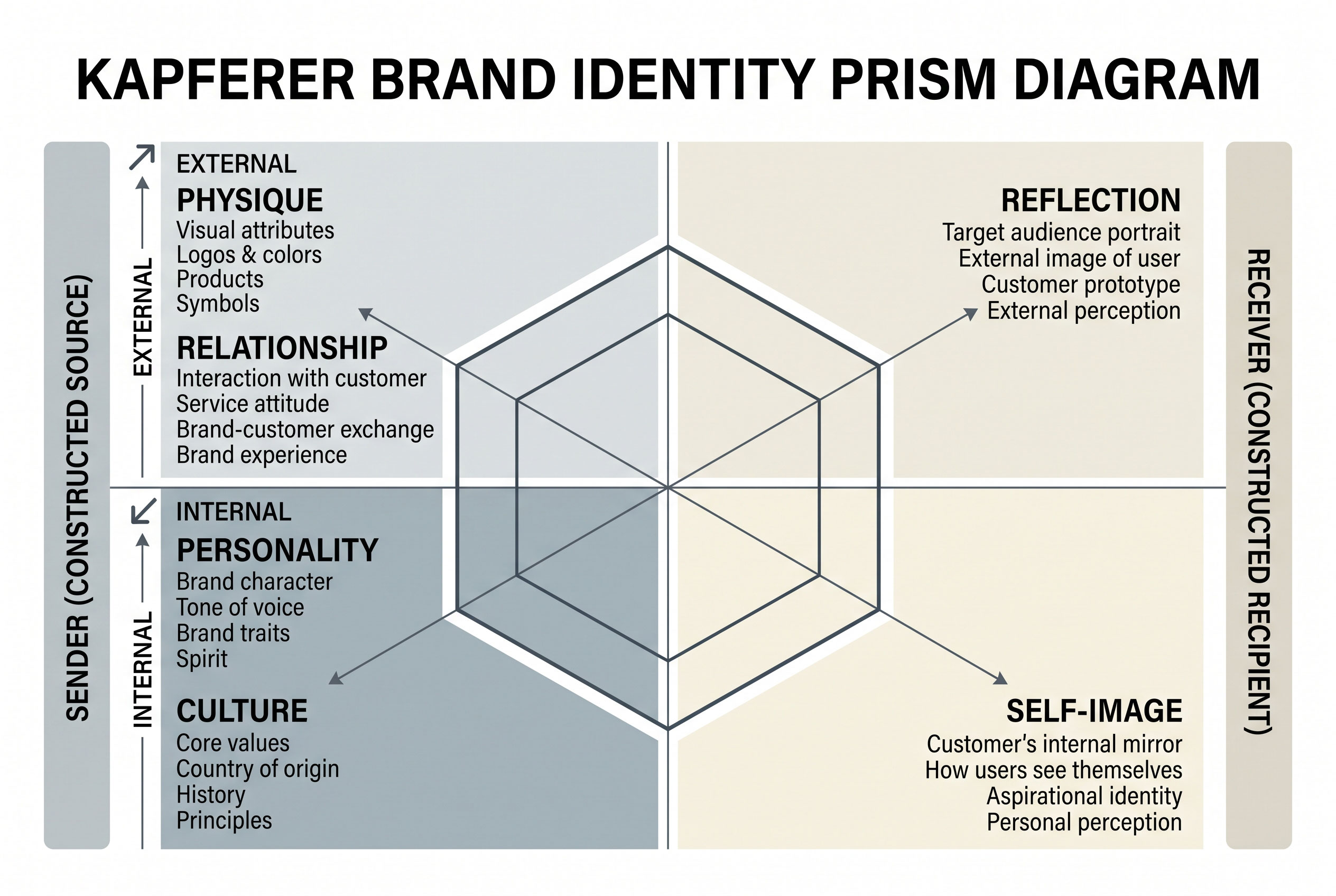
Jean-Noël Kapferer's brand identity prism describes
six facets: physique, personality, culture, relationship, reflection, and
self-image. Two facets concern the sender and two the receiver, and the
remaining two connect them [3].
Brand guidelines
Guidelines translate an identity into rules that different
teams and outside agencies can follow. A typical document covers logo clearance
space and minimum sizes, permitted colors, typeface hierarchy, photographic
style, and examples of correct and incorrect use. Their purpose is consistency
across many channels, from packaging to websites.
Notable identity changes
Public reaction to identity changes has sometimes forced
reversals. According to contemporaneous press coverage, the retailer Gap
introduced a new logo in October 2010 and returned to its earlier one within
about a week after negative reaction [7]. Coverage also reports that Tropicana
restored its previous carton design in early 2009, shortly after a redesign,
following customer complaints [7]. Analysts disagree on how much these episodes
reflect design quality versus attachment to familiar marks, and sales effects
are reported inconsistently.
Criticism and debate
Critics raise several points. Some argue that identity work
can emphasize surface presentation over substance, and that mismatches between
stated values and conduct reduce credibility. Others note that audiences, not
organizations, ultimately define what a brand means, which limits how much any
identity can be controlled [5]. Supporters respond that a coherent identity
reduces confusion and provides a stable reference for internal decisions.
Empirical evidence on the financial return of identity investments varies by
study and sector.
Current status
Digital media has changed practice in recent decades. Many
identities are now designed as flexible systems that adapt to screens, motion,
and small icons, and simplified logos are common. Guidelines increasingly exist
as online resources rather than printed manuals.