
A logo is a graphic mark, emblem, or stylized name
used by an organization, product, event, or individual to identify itself and
distinguish it from others. Logos may consist of text, images, or both, and
typically appear on products, packaging, signage, documents, and digital media.
They serve as visual identifiers and are often legally protected as trademarks.
The word is a shortened form of logotype, a printing
term. Although everyday usage treats "logo" as the whole visual
identity of a company, specialists distinguish a logo from a broader brand
identity, which includes colors, typefaces, imagery, and tone.
|
Field |
Details |
|
Type |
Visual identifier |
|
Common forms |
Wordmark, lettermark, pictorial mark, abstract mark,
mascot, emblem, combination mark |
|
Typical uses |
Packaging, signage, websites, uniforms, official documents |
|
Legal status |
Often registrable as a trademark |
|
Common file formats |
Vector (SVG, EPS, PDF) and raster (PNG, JPEG) |
|
Related fields |
Graphic design, branding, trademark law |
Etymology
"Logo" derives from logotype, formed from
the Greek logos ("word") and typos
("impression" or "stamp"). In 19th-century printing, a
logotype was a single piece of type that cast a whole word or group of letters,
saving compositors time. Dictionaries commonly date the shortened form
"logo" to the 1930s, and the sense of a company's identifying symbol
spread through the mid-20th century. Exact first-use dates vary between
sources.
History
Early identifying marks
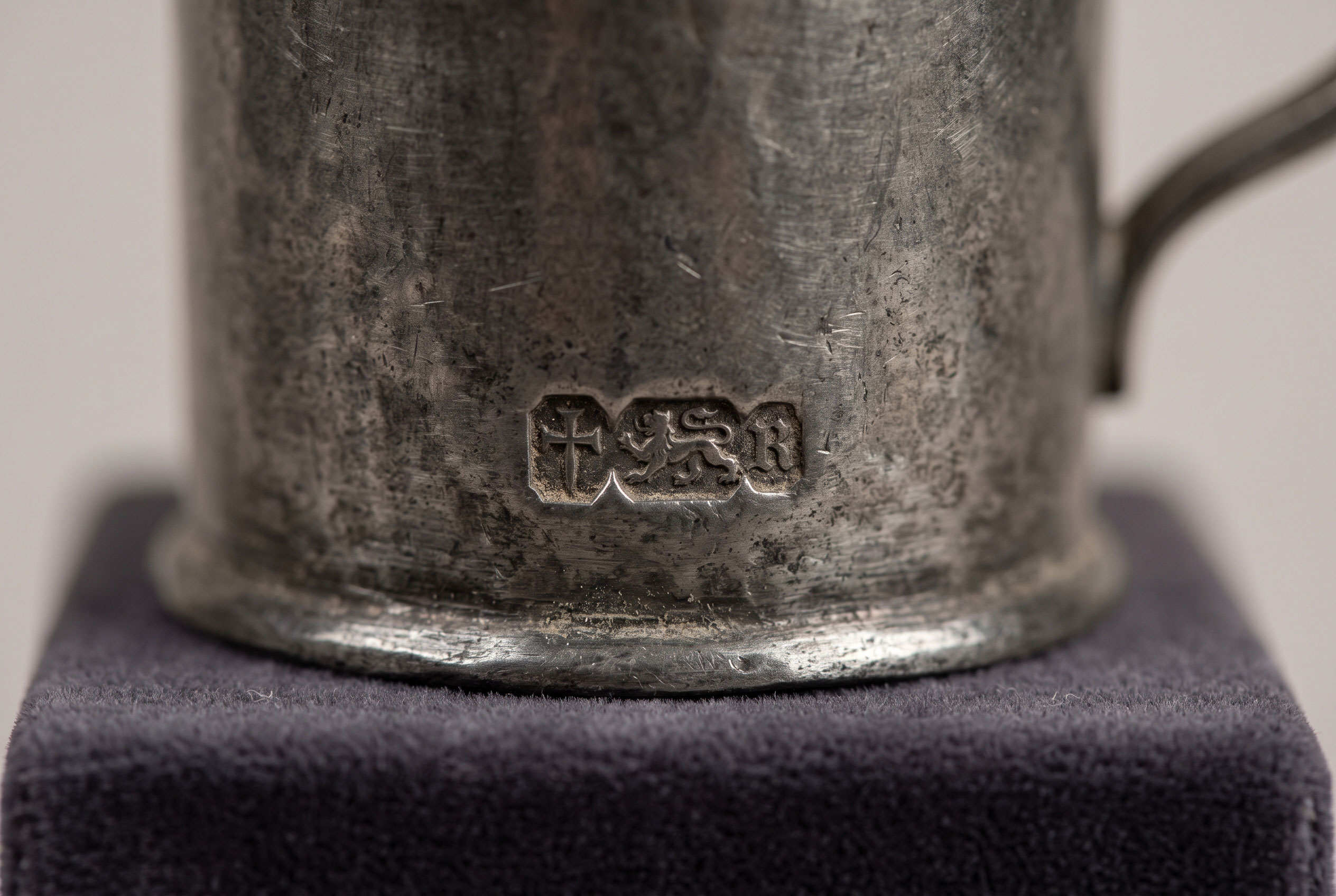
Marks of ownership and origin predate the word by millennia.
Potters, stonemasons, and metalworkers in ancient and medieval societies
stamped goods with symbols. In medieval Europe, guilds and merchants used merchant
marks and hallmarks to identify makers and guarantee quality, partly for
legal accountability.
Industrial era and trademark law
Mass production and national distribution increased the need
to distinguish one maker's goods from another's. The United Kingdom's Trade
Marks Registration Act of 1875 created a formal registry, and the red
triangle of the Bass Brewery is widely cited as one of the first marks
registered when the system opened in 1876. In the United States, an 1870
federal trademark statute was struck down by the Supreme Court in 1879, and a
durable federal framework arrived with the Lanham Act of 1946.
Modernist corporate identity
In the 20th century, companies began treating the logo as
part of a coordinated identity system. German architect Peter Behrens is
frequently credited with an early comprehensive program for the electrical firm
AEG around 1907. American designer Paul Rand later became closely
associated with corporate identity, notably through his work for IBM from 1956
onward; the striped IBM wordmark dates to the early 1970s.
Digital era
Screens, mobile apps, and social media introduced new
constraints. Logos now need to remain legible at very small sizes, such as
browser tab icons, and to work in animated and responsive forms. Many
organizations have adopted simplified, flat designs, and variants of a single
logo for different contexts.
Types of logos
Classification schemes differ among designers, and many real
logos fit more than one category. The most common distinctions are:
|
Type |
Description |
Example |
|
Wordmark |
The organization's name set in distinctive lettering |
Coca-Cola script |
|
Lettermark |
Initials or an abbreviation |
IBM |
|
Pictorial mark |
A recognizable image or icon |
Apple's apple silhouette |
|
Abstract mark |
A non-representational shape |
Nike's "Swoosh" |
|
Mascot |
An illustrated character |
Michelin's Bibendum |
|
Emblem |
Text enclosed within a badge or seal |
Harley-Davidson's bar and shield |
|
Combination mark |
Symbol and text used together |
Mastercard's overlapping circles with name |
Nike's Swoosh is often described as abstract, although some
writers consider it a stylized representation of a wing. Such overlaps are
common.
Design characteristics
Design practitioners commonly cite several qualities, though
these are professional conventions rather than fixed rules:
- Simplicity:
fewer elements aid recognition and reproduction.
- Scalability:
the mark remains legible from a favicon to a billboard.
- Versatility:
it works in color, single color, and reversed (light on dark) versions.
- Distinctiveness:
it differs enough from competitors' marks to avoid confusion.
- Appropriateness:
its style suits the sector and audience.
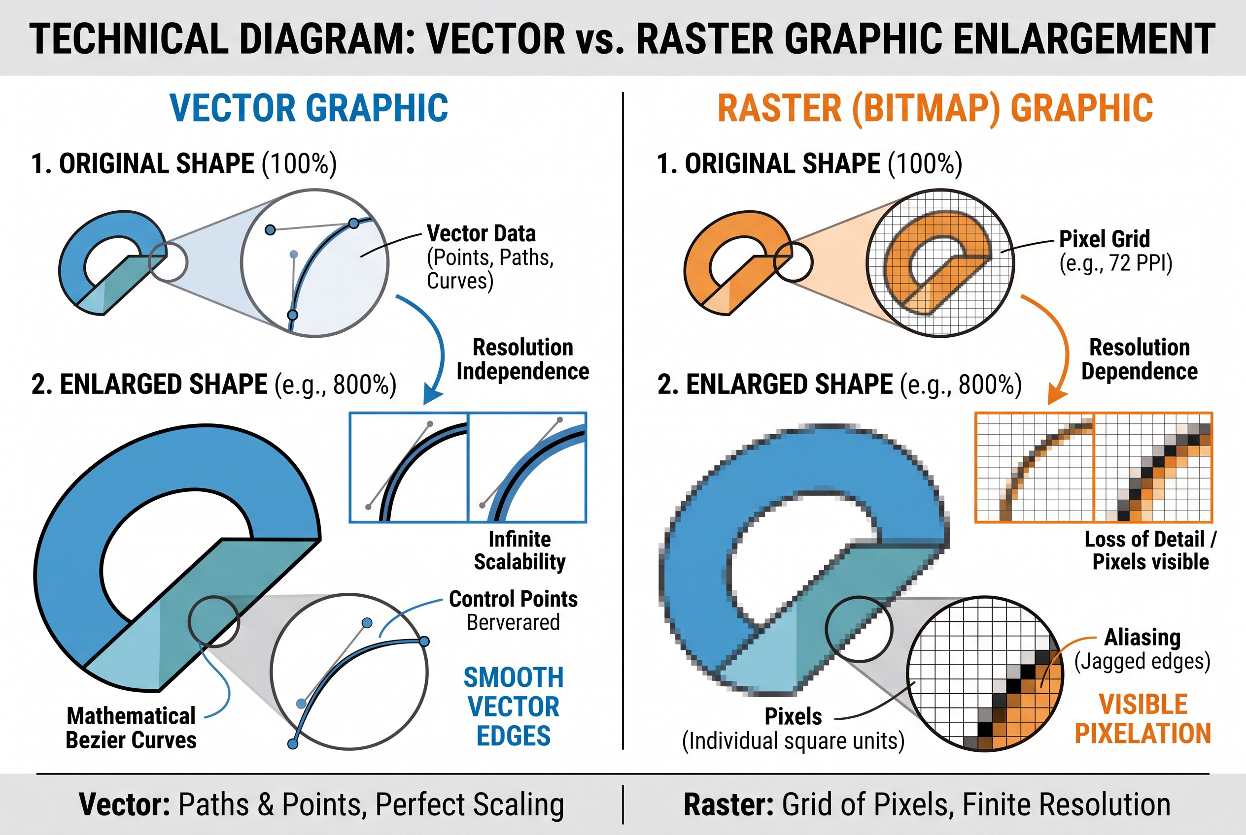
Designers usually create logos as vector graphics,
which are defined by mathematical paths and scale without loss of quality. Raster
images, built from pixels, are used mainly for web display.
Legal status
A logo can usually be registered as a trademark, giving the
owner exclusive rights to use it for specified goods or services in a
jurisdiction. Registration typically requires that the mark be distinctive and
not confusingly similar to existing marks. Rules vary by country, and
international registration is possible through systems administered by the World
Intellectual Property Organization (WIPO).
Copyright may separately protect the artwork of a logo,
though simple shapes and lettering may fall below the threshold of originality
in some jurisdictions. Ownership of the design is often governed by the
contract between the organization and the designer.
Logo versus brand
A common misconception holds that a logo is the
brand. Most branding literature treats a brand as the sum of perceptions,
experiences, and associations people hold about an organization. The logo is
one visible element that helps trigger those associations. A well-known mark
therefore reflects the reputation attached to it, rather than creating that
reputation by itself.
Logos are also distinct from icons (functional
interface symbols), signs (informational symbols such as road signs),
and slogans (verbal taglines), although these elements may appear
together.
Redesigns and public reaction
Organizations periodically change logos to reflect strategy,
mergers, or shifts in style. Public reactions to redesigns are sometimes
strongly negative. A frequently cited case is the clothing retailer Gap, which
introduced a new logo in October 2010 and reverted to its original design
within about a week after criticism online. Researchers and commentators
disagree on how much such reactions affect business performance, and no
consensus figure exists.
Current status
Logos remain central to commercial, institutional, and
political identity, and increasingly appear in adaptive forms such as animated
and motion-responsive marks. Design trends toward minimalism continue to prompt
debate about whether distinctiveness is being reduced.