
Color theory is the body of principles that describes
how colors are produced, mixed, organized, and perceived, and how they can be
combined in visual work. It is used in painting, design, photography, printing,
and digital media. Its core tools are the color wheel, a set of color
models that predict mixing results, and rules of color harmony that
describe combinations considered visually coherent.
Color theory is not a single unified science. It combines
practical guidance from artists’ workshops, results from physics and the study
of human vision, and conventions developed by designers. Some of its rules are
empirical and measurable, while others, particularly those about harmony and
emotional effect, are matters of convention and are debated.
|
Infobox |
|
|
Field |
Art, design, optics, visual perception |
|
Core tools |
Color wheel, color models, harmony schemes |
|
Early figures |
Isaac Newton, Johann Wolfgang von Goethe, Michel Eugène
Chevreul, Albert Munsell |
|
Key concepts |
Hue, saturation, value, additive and subtractive mixing |
|
Applications |
Painting, graphic design, printing, display technology |
Background
Practical knowledge of pigments and mixing is ancient, but
systematic color theory is usually traced to the seventeenth and eighteenth
centuries. Writers on painting had long described color mixing in terms of a
few basic pigments, and the question of which colors were “primary” shifted
over time.
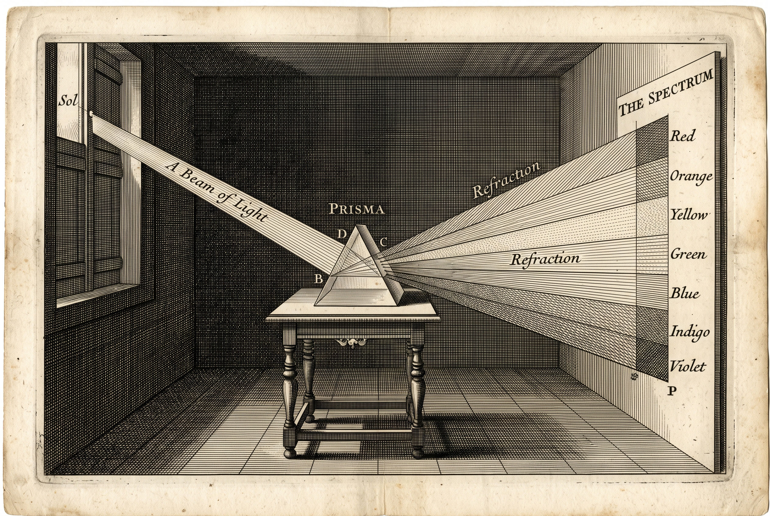
In 1666, Isaac Newton passed sunlight through a prism
and showed that white light separates into a spectrum. In his book Opticks
(1704), he later arranged the spectral colors in a circle, which is widely
cited as an early ancestor of the modern color wheel. Newton’s work treated
color as a property of light, which differed from the pigment-based practice of
painters.
Development in the nineteenth century
Johann Wolfgang von Goethe published Theory of
Colours (Zur Farbenlehre) in 1810. It disputed parts of Newton’s
account and emphasized how colors appear to an observer, including afterimages
and contrast effects. Physicists generally did not accept his challenge to
Newton, but the work influenced later study of perception and the use of color
in art.
Michel Eugène Chevreul, a French chemist employed at
the Gobelins tapestry works, published a study of simultaneous color contrast
in 1839. He observed that adjacent colors alter each other’s apparent
appearance, an effect that later painters, including the Impressionists and Neo-Impressionists,
are commonly said to have drawn on.
Systematization in the twentieth century
In 1905, American painter and teacher Albert Munsell
introduced a system describing color by three measured dimensions. The Munsell
color system remains in use in some fields, such as soil science. In the
1920s, teachers at the Bauhaus school, including Johannes Itten,
developed influential classroom approaches to color contrast and harmony. In
1931, the International Commission on Illumination (CIE) established a
standard colorimetric system based on human vision measurements.
Fundamental concepts
Hue, saturation, and value
Most descriptions of a color rely on three attributes:
- Hue:
the position of a color within the spectrum or around the wheel, such as
red, green, or blue.
- Saturation
(also called chroma or intensity): how pure or vivid a color is, compared
with a gray of similar lightness.
- Value
(or lightness): how light or dark a color is.
Different systems define these terms slightly differently,
and “saturation” and “chroma” are not strictly identical in all models.
The color wheel
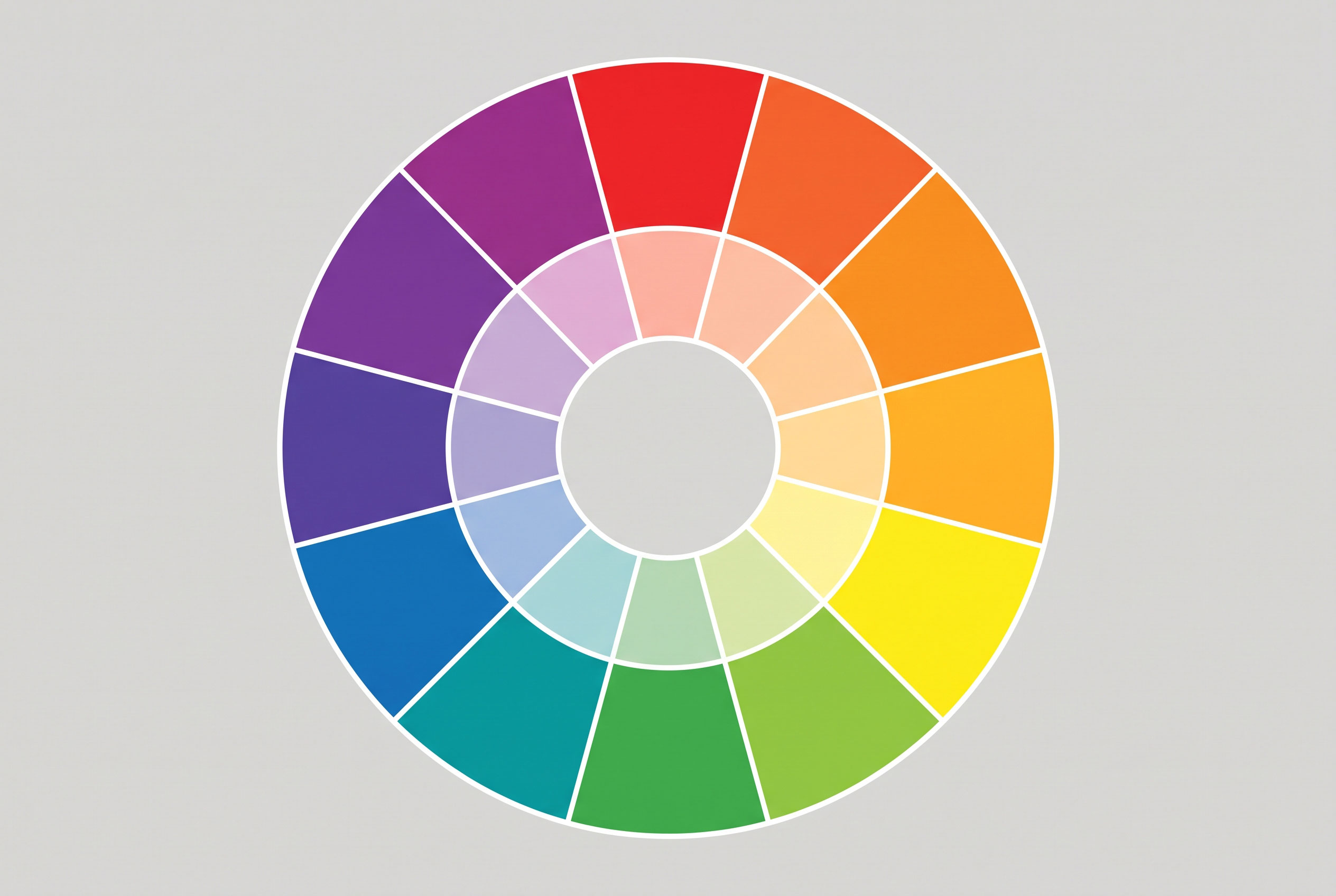
A color wheel arranges hues in a circle so that
relationships between them can be seen. The traditional artists’ wheel uses red,
yellow, and blue as primaries. Mixing two primaries produces a secondary
color (orange, green, violet), and mixing a primary with an adjacent secondary
produces a tertiary color.
Note: The red-yellow-blue primaries are a historical
convention. Modern color science does not treat them as the only valid primaries,
and they cannot reproduce the full range of visible colors.
Tints, tones, and shades
Adding white to a hue produces a tint, adding gray
produces a tone, and adding black produces a shade. These terms
describe changes in value and saturation rather than hue.
Color models
A color model is a mathematical or practical system
for describing how colors combine. The two most common mixing behaviors differ
in how they work.
|
Model |
Mixing behavior |
Typical primaries |
Common use |
|
RGB (additive) |
Light is added; combining all primaries approaches white |
Red, green, blue |
Screens, projectors, cameras |
|
CMYK (subtractive) |
Pigments absorb light; combining them approaches dark |
Cyan, magenta, yellow, plus black (key) |
Offset and inkjet printing |
|
RYB (traditional) |
Historic painters’ model of pigment mixing |
Red, yellow, blue |
Art education |
In additive mixing, colors are created by combining emitted
light. In subtractive mixing, pigments or dyes subtract wavelengths from
reflected light. Because the two approaches use different primaries, a color
shown on a screen may not be exactly reproducible in print.
Digital design often uses the HSL and HSV
models, which rearrange RGB values into hue, saturation, and lightness or
value. These models were developed in the 1970s for computer graphics and are
intended to be more intuitive for users than raw RGB values.
Color harmony
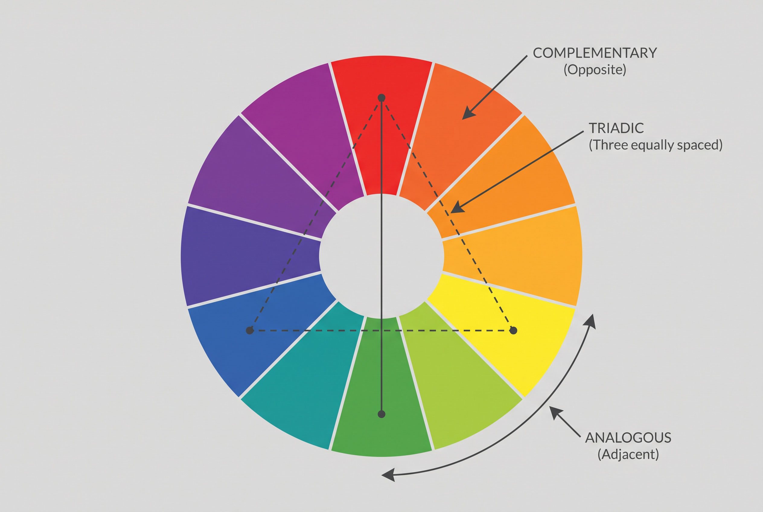
Color harmony refers to combinations of colors that
observers tend to find balanced or pleasing. Common schemes derived from the
color wheel include:
- Complementary:
two hues opposite each other on the wheel, such as blue and orange.
- Analogous:
hues adjacent on the wheel, such as yellow, yellow-green, and green.
- Triadic:
three hues evenly spaced around the wheel.
- Split-complementary:
one hue plus the two hues adjacent to its complement.
- Monochromatic:
variations in value and saturation of a single hue.
These schemes are guidelines rather than laws. Research on
color preference has found that individual and cultural factors strongly affect
which combinations people prefer, so harmony rules are better understood as
design conventions than universal findings.
Color and perception
Color theory also addresses how context changes appearance.
In simultaneous contrast, a color looks different depending on its
surroundings; a gray patch appears lighter on a dark background than on a light
one. Colors are also described as warm (reds, oranges, yellows) or cool
(blues, greens), and warm colors are often said to appear closer to the viewer.
These effects are well documented in design practice, though their strength
varies between observers.
Cultural and emotional associations
Claims that specific colors cause particular emotions are
common in design literature, but evidence is mixed. Associations vary by
culture and context. White, for example, is linked with mourning in some East
Asian traditions and with weddings in many Western ones. Researchers generally
describe such associations as learned and situational rather than fixed.
Applications
Color theory informs painting, interior and fashion design,
graphic and interface design, photography, and film grading. It also supports accessibility
practice: guidelines such as the Web Content Accessibility Guidelines (WCAG)
set minimum contrast ratios between text and background, which helps
people with low vision or color vision deficiency read content. In print and
display technology, color management systems translate colors between RGB and
CMYK spaces.
Current status
Color theory continues to evolve alongside technology.
Perceptually uniform color spaces such as CIELAB, and newer spaces for
wide-gamut displays, extend older models, while the traditional wheel remains a
standard teaching tool.